The Bootstrap Grid System is used for layout, specifically Responsive Layouts. Understanding how it works is vital to understanding Bootstrap. The Grid is made up of groupings of Rows & Columns inside one or more Containers.
The Bootstrap Grid can be used alone, without the Bootstrap JavaScript and other CSS Components. You just need to download and
reference the "bootstrap-grid.css" which contains the Grid and Flexbox classes. More info on only using the
Bootstrap Grid CSS is here in the docs.
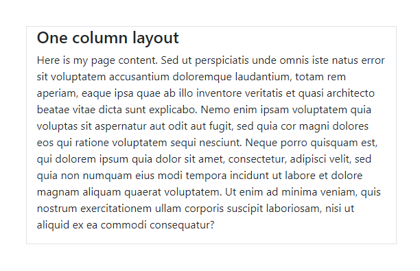
            <div class="container">
               <div class="row">
                  <div class="col">I'm your content inside the grid!</div>
               </div>
            </div>
This gives us one big “column” horizontally across the viewport…
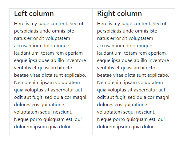
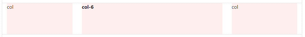
            <div class="container">
               <div class="row">
                  <div class="col">Left column</div>
                  <div class="col">Right column</div>
               </div>
            </div>
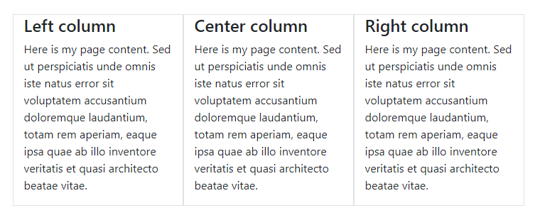
            <div class="container">
               <div class="row">
                  <div class="col">Left column</div>
                  <div class="col">Middle column</div>
                  <div class="col">Right column</div>
               </div>
            </div>
Basic Grid concepts are quickly understood, but you may be wondering why all of this HTML markup is neccessary. You might have some questions like…
I will address Grid questions like these a little further down. But, first I want to take a step back to explain something very important about using the Grid. Understanding the “Rules of the Grid” will save you a lot of time and frustration. Read them carefully…
Those rules are very IMPORTANT. The Rows & Columns always work together, and you should never have one without the other. Bad stuff will happen if you don’t follow those 3 simple Grid rules, exactly. I’ve answered countless Bootstrap questions on Stack Overflow by simply applying those rules. At first this might sound complicated, but it’s really easy once you understand how the Grid works.
In the basic examples before you may have noticed that I used the .container class to wrap the .row.
The Container is the root (a.k.a: top-level, outermost) element of the Bootstrap Grid.
            <div class="container">
               <div class="row">
                  <div class="col">I'm content inside the grid!</div>
               </div>
            </div>
The Container can be used to hold any elements and content. It’s not only used for the Grid Rows & Columns. For example, this is perfectly valid Bootstrap markup:
            <div class="container">
               <h2> My Heading</h2>
               <div class="row">
                  <div class="col"> I'm content inside the grid!</div>
               </div>
            </div>
At first, the Container may seem trivial or unnecessary, but it’s very important to control width of the layout. The Container is also used to evenly align the left and right edges of the layout within the browser’s viewport.
Bootstrap 4 has 2 types of Containers. In my examples I used .container, but there is also the
full-width .container-fluid. You can use either one:
<div class="container"> </div>
<div class="container-fluid"> </div>
The .container scales down in width responsively (as the screen width narrows) so that eventually
it becomes full-width like the .container-fluid on smaller devices.
Note: A Container can be used to contain any content, not just the Grid Rows & Columns. But, if you do utilize the Grid Rows & Columns, the Rows should be placed inside a Container. Try the Container demo on Codeply
When utilizing the Grid, one more Rows will be placed inside the Container. You can have multiple Rows in a Container, and you can have multiple Containers on one page. It all depends on what layout you’re trying to accomplish, but don’t get too concerned with that yet.
Rows have a negative left/right margin of -15px. The Container padding of 15px is used to counteract the negative margins of the Row. This is to keep content evenly aligned on the edges of the layout. If you don’t put a Row in a Container, the Row will overflow it’s container, causing an undesirable horizontal scroll.
Notice that I've grouped "Rows & Columns" together in a single section for this article. This is because you can't have one without the other as explained earlier in the "Rules of the Grid".
For a while now I've wished that the Bootstrap .row wasn't actually named "row".
The name "row" is often misleading, and obscures the actual purpose of the .row.
When you think "row", you probably think horizontal line, which is okay, BUT, it's better to think of the
.row simply as a parent of columns.
Think of the Row as a group of Columns
This is because columns inside the .row aren't always laid-out horizontally across the viewport. Some times we want the column layout to be horizontal,
while other times we want the columns to layout vertically down the viewport. The concept of horizontal vs. vertical layout is the essence of
Responsive Design. The sole purpose of the "row" is to contain 1 or more "columns".
Again, the Row's only purpose is to contain Coumns.
        ⛔
        <div class="row">
           This is very bad, wrong way, no bueno!!
        </div>
        <div class="row">
           <p>This is also very bad, the wrong way!!</p>
        </div>
        <div class="row">
           <h2>No headings either! This is the wrong way!!</h2>
        </div>
Columns, and only columns, are placed inside the Row.
        ✅
        <div class="row">
           <div class="col">Happy :-) This is the right way.</div>
        </div>
It's also important to mention that the .row is display:flex. As Flexbox children,
the Columns in each row are the same height. Because of Flexbox, horizontal and vertical alignment (align right, center, bottom, etc..)
is easily accomplished using Bootstrap 4's Flex and Auto-margin Utility classes.
Now it's time to look deeper at Rows & Columns, and exactly how they work together.
There are different "types" of Columns, and different ways to use them in your layout. They are magic.
All the things Bootstrap 4 Columns can do...
All you need to know about Bootstrap Columns...
Columns create horizontal divisions across the viewport. The space between the columns is called the "gutter".
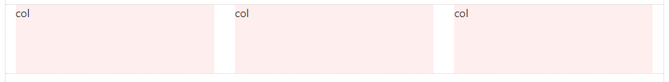
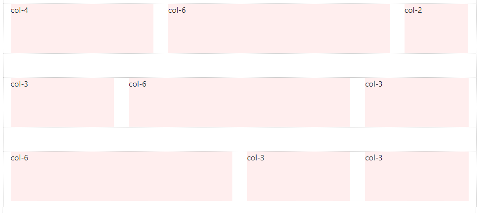
The classic Bootstrap grid has 12 column units:
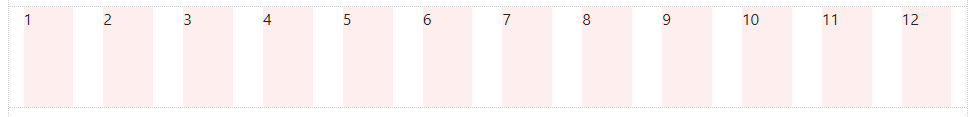
Note for Dummies: Columns aren't actually light pink. That is only used for you to see the left/right boundaries of the Columns. In most cases you're not going to use all 12 individual columns as illustrated above. Instead you'll be using some combination of the 12 to contain page content…
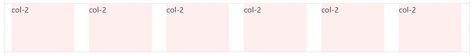
So, the columns can be evenly divided up into factors of 12. For example, 6 columns (12/6 = 2):
And, you can do the math…
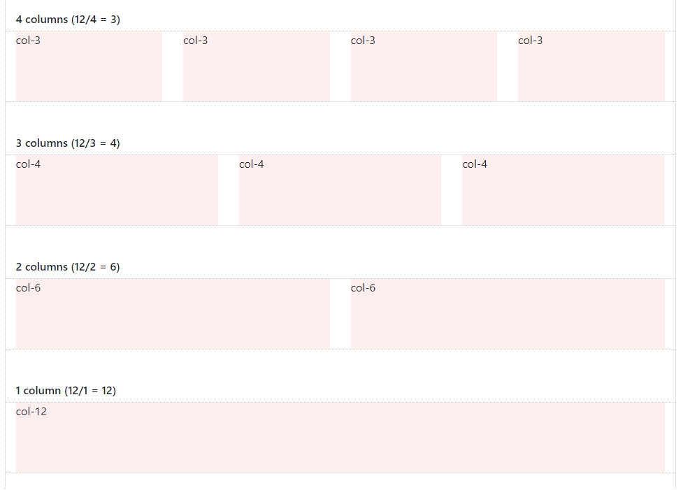
The columns can be split-up using any part of the 12 units. And, it's okay to use less than 12. It's also okay to use more than 12 which I'll show you later.
With all of this flexibility, the layout possibilities are seemingly endless…
But, the Grid is not always about 12. Thanks to Flexbox, Bootstrap 4 has a new "Auto-layout" Columns. These unit-less columns give you even more flexibility when it comes to designing layouts.
Now you know how to use Columns to create a horizontal layout. But wait... there’s more! Let’s talk about some fancier things Columns can do.
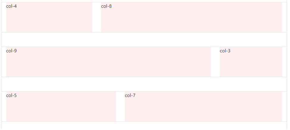
As you saw before, Columns can be different widths:
Did you know that, Column width can change depending on screen width?
This is called Responsive Design, and I will tell you exactly how it works a very soon. But, first things first, I need to finish telling you about Columns. Remember before when I said "It's okay to use more than 12 Columns in a Row"?
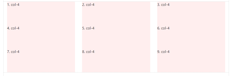
Columns in the same Row layout horizontally across, and then stack vertically down. This vertical "stacking" or "wrapping" occurs when the Column units in a single Row exceed 12. This is known as "Column Wrapping"… Columns in the same Row wrap to the next line every 12 units:
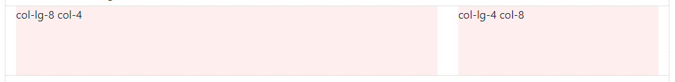
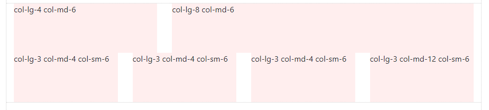
Column width and “wrapping” can be controlled using different Responsive Grid Tiers (a.k.a “Grid Breakpoints”):
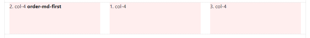
Columns can change position (re-order) relative to siblings in the same Row:
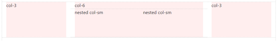
Columns can contain baby Rows & Columns. This is called “Nesting”:
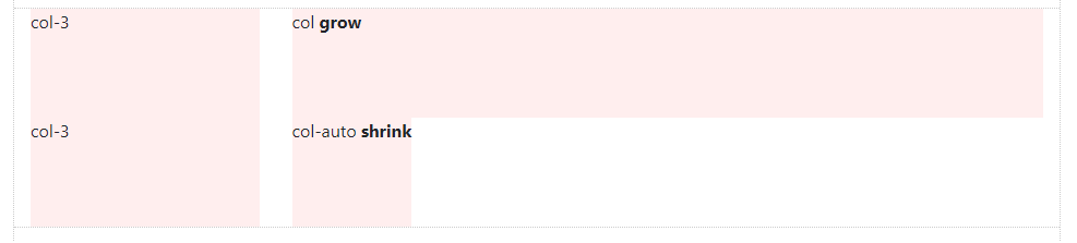
Columns can “grow” or “shrink” in width. These are Auto-layout Columns:
sm, -md, -lg, and -xl mean. I will explain more
about how to use the Grid for Responsive Design.
 How to... Bootstrap