Bootstrap 4 has 5 Responsive Tiers (a.k.a. “Breakpoints”) that you may have noticed in some of the previous Column examples (ie; col-lg-4, col-md).
Bootstap 4 Responsive Breakpoints (based on screen width):
-xs infix that was used for Bootstrap 3.x is longer used in Bootstrap 4.x. So instead of
using col-xs-6, it’s simply col-6.
Bootstrap uses CSS media queries to establish these Responsive Breakpoints. They enable you to control Column behavior at different screen widths.
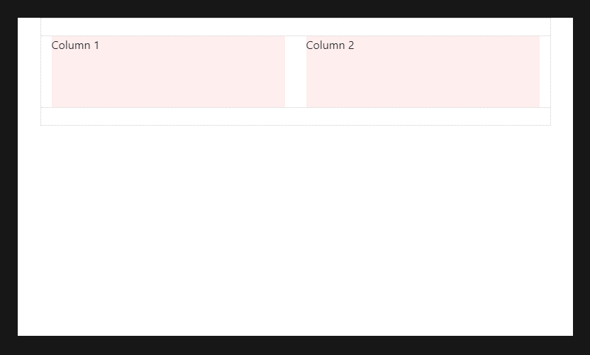
For example: here are 2 columns, each 50% width:
        <div class="container">
           <div class="row">
              <div class="col-sm-6">Column 1</div>
              <div class="col-sm-6">Column 2</div>
           </div>
        </div>
The col-sm-6 means use 6 of 12 columns wide (50%), on a typical small device width (greater than or equal to 768 px):
On less than 768px, the 2 columns become 100% width and stack vertically:
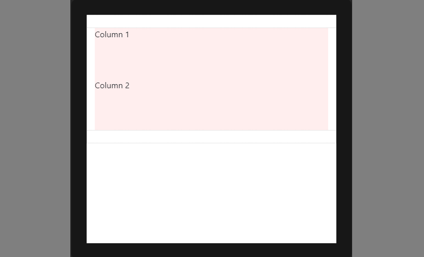
This is because (xs) is the default or implied breakpoint. Since I didn’t specify a default Column width, the 50% width was only applied on 768px and wider for the sm breakpoint.
Since (xs) is the default breakpoint, the col-12 is implied. So, this:
<div class="col-12 col-sm-6">Column</div>
Is effectively the same as this:
<div class="col-sm-6">Column</div>
Larger breakpoints, override Smaller breakpoints.
xs (default) > sm > md > lg > xlOr, in reverse…
xl > overrides lg > overrides md > overrides sm > overrides (xs)
Therefore, col-sm-6 really means 50% width on small-and-up. For the same column width on all tiers, just set the width for the smallest tier that’s desired. For example:
For example:
<div class="col-lg-3 col-md-3 col-sm-3">..</div> is the same as, <div class="col-sm-3">..</div>
For a different column width on a larger tier, use the appropriate larger breakpoint to override the smaller breakpoint. For example, 3 columns wide on sm, and 4 columns wide on md-and-up:
<div class="col-sm-3 col-md-4">..</div>
The Bootstrap 4 auto-layout columns also work responsively. Because of their simplicity, I prefer them over the classic 12-unit columns. The auto-layout columns are perfect for any layout scenarios where equal-width columns are required. But, don’t forget, the 12-unit columns can be mixed-in as needed.
Take a look at a few auto-layout Grid examples…
3 equal-width columns. The `cols` remain horizontal at all widths, and don’t stack vertically because the xs breakpoint is the default:
        <div class="container">
           <div class="row">
              <div class="col">1</div>
              <div class="col">2</div>
              <div class="col">3</div>
           </div>
        </div>
3 equal-width columns (responsive). In this example, the `cols` remain horizontal until the sm breakpoint of 576px, and then stack vertically:
        <div class="container">
           <div class="row">
              <div class="col-sm">1</div>
              <div class="col-sm">2</div>
              <div class="col-sm">3</div>
           </div>
        </div>
Remember, you can switch out sm for whatever breakpoint (md,lg,xl) is needed.
2 columns, left sidebar & right. Here’s an example of combining the classic defined-width columns, with the auto-layout columns. The right column will automatically grow to fill the width. The sidebar will stack on top at the sm breakpoint of 576px:
        <div class="container">
           <div class="row">
              <div class="col-sm-2">sidebar</div>
              <div class="col">main</div>
           </div>
        </div>
Columns will stack vertically (and become full-width) at the smaller screen widths unless you use a
specific col-* class in your HTML markup. Use a specific col-* to prevent that vertical stacking.
The smaller grid classes also apply to larger screens unless overridden specifically for larger screen width.
So, <div class="col-md-6"></div> is effectively the same as <div class="col-md-6 col-lg-6"></div>.
Therefore, you only need to use the class for the smallest width you want to support.
Rows are display:flex, and therefore Columns are equal height in the same row. Use auto-margins or Flexbox align-items and
justify-content for horizontal or vertical alignment (centering, bottom, right, etc..).
 How to... Bootstrap