The CSS is the most essential part of Bootstrap. The Bootstrap CSS can be used alone, without the Bootstrap JavaScript components. Generally speaking, Bootstrap’s CSS provides two things…
Buttons, fonts, colors, badges, typography, progress bars, alerts, etc…
Layout helpers using “rows” and “columns”.
First, I’ll explore all of the element styles Bootstrap provides to “make Web development faster and easier”. Remember that simple Bootstrap example I showed earlier?
Let’s understand what Bootstrap really does to the Web page...
First of all, the Bootstrap CSS includes Reboot which “normalizes” the Web page styles. Web browsers have different, somewhat ugly, styles that are applied to Web pages by default.
Since each browser’s defaults are a little different, Bootstrap uses Reboot to override the browser defaults, and provide the same “elegant, consistent baseline” to build upon, regardless of the browser.
This means that if the Web page is viewed on Safari, Chrome, Firefox or IE it will start out with the same baseline CSS styles.
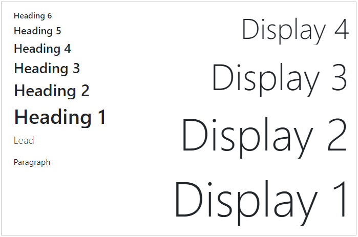
Text readability and scale are an important consideration in Web design. Bootstrap took this into consideration when selecting the native font stack for Bootstrap 4:
        $font-family-sans-serif:
          // Safari for OS X and iOS (San Francisco)
          -apple-system,
          // Chrome < 56 for OS X (San Francisco)
          BlinkMacSystemFont,
          // Windows
          "Segoe UI",
          // Android
          "Roboto",
          // Basic web fallback
          "Helvetica Neue", Arial, sans-serif,
          // Emoji fonts
          "Apple Color Emoji", "Segoe UI Emoji", "Segoe UI Symbol" !default;
        The Bootstrap CSS makes the text look like this…
Bootstrap's font stack (included in the CSS) makes the text look like this…
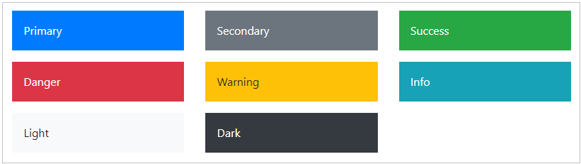
No one gets too excited about a Web page that lacks color. Color is often used to convey meaning, and highlight specific page content. Bootstrap provides 8 contextual colors that can be easily applied to HTML elements. You’ll see that colors are named to convey meaning.
Additionally, Bootstrap CSS can be used to style and format any page content such as Tables, Forms, Images and Figures.
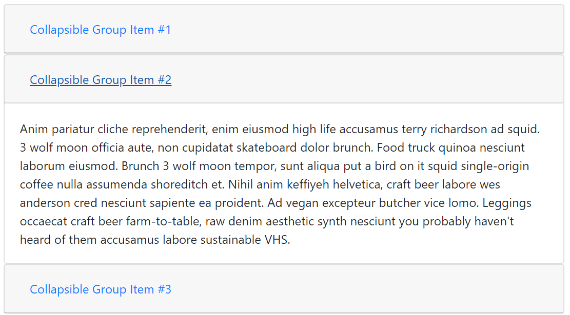
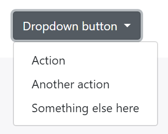
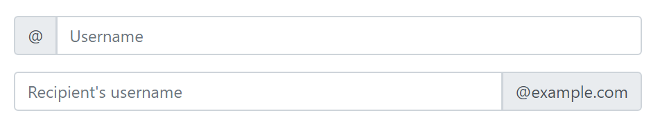
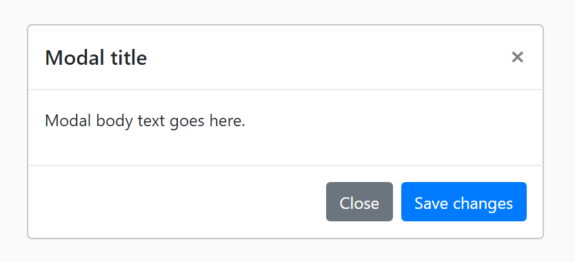
Take a quick glance at the following examples of the Bootstrap Components. These are just some the “things” that can be easily “plugged-in” to your Web pages when using Bootstrap…


Using any of these Bootstrap Components is very easy. It’s just a matter of referencing the appropriate Bootstrap CSS class in the HTML markup. For example, here’s how we use Bootstrap’s primary colored button on a Web page…
<button type="button" class="btn btn-primary">Primary</button>
So, the buttons’ style comes from the CSS “rules” for the .btn and .btn-primary CSS selectors. Here are the relevant rules in the Bootstrap CSS…
        .btn {
          display: inline-block;
          font-weight: 400;
          text-align: center;
          white-space: nowrap;
          vertical-align: middle;
          -webkit-user-select: none;
          -moz-user-select: none;
          -ms-user-select: none;
          user-select: none;
          border: 1px solid transparent;
          padding: 0.375rem 0.75rem;
          font-size: 1rem;
          line-height: 1.5;
          border-radius: 0.25rem;
          transition: color 0.15s ease-in-out, background-color 0.15s ease- in-out, border-color 0.15s ease-in-out, box-shadow 0.15s ease-in-out;
        }
        .btn-primary {
          color: #fff;
          background-color: #007bff;
          border-color: #007bff;
        }
You might be wondering…
.btn + .btn-primary?“Bootstrap’s components are built with a base-modifier class approach. This means the bulk of the styling is contained to a base class (e.g., .btn) while style variations are confined to modifier classes (e.g., .btn-danger).” This base-modifier approach in Bootstrap’s CSS makes customizing Bootstrap much easier which I will explain later in this article.
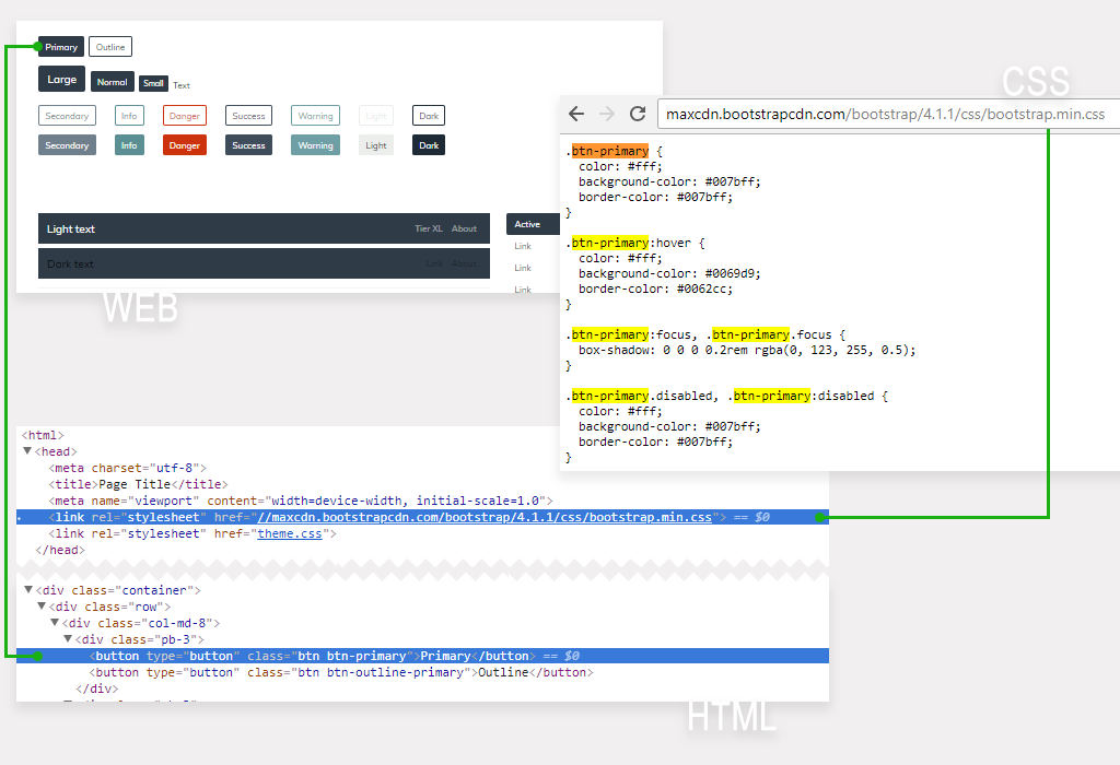
As you can see in the picture above, the “Primary” button has a different color than the normal Bootstrap blue color. That’s because this Web page also includes a “theme.css” stylesheet after the “bootstrap.min.css”.
The CSS styles (or rules) defined in “theme.css” are overriding the default Bootstrap CSS styles, such as the
definition of the .btn-primary color. I will explain Bootstrap theming and
customization later in this article.
Badges
        <span class="badge badge-primary">Badge</span>
        <span class="badge badge-pill badge-primary">Rounded Badge</span>
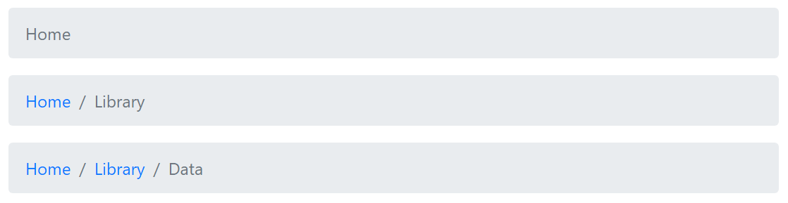
Breadcrumbs
        <nav aria-label="breadcrumb">
          <ol class="breadcrumb">
            <li class="breadcrumb-item"><a href="#">Home</a></li>
            <li class="breadcrumb-item"><a href="#">Library</a></li>
            <li class="breadcrumb-item active">Breadcrumb</li>
          </ol>
        </nav>
Buttons
        <button type="button" class="btn btn-primary btn-lg">Large</button>
        <button type="button" class="btn btn-primary btn-sm">Small</button>
Cards
        <div class="card">
         <div class="card-body d-flex flex-column align-items-start">
          <h4 class="card-title text-primary">Card Outline</h4>
          <p class="card-text">With supporting text.</p>
          <a href="#" class="btn btn-primary mt-auto">Button</a>
         </div>
        </div>
Forms & Inputs
        <form role="form">
            <div class="form-group row">
                <label class="col-md-2 col-form-label form-control-label">
                    First
                </label>
                <div class="col-md-4">
                    <input class="form-control" type="text" value="Jane">
                </div>
                <label class="col-md-1 col-form-label form-control-label">
                    Last
                </label>
                <div class="col-md-5">
                    <input class="form-control" type="text" value="Bishop">
                </div>
            </div>
            <div class="form-group row">
                <label class="col-lg-2 col-form-label form-control-label">
                    Address
                </label>
                <div class="col-lg-10">
                    <input class="form-control" type="text">
                </div>
            </div>
            <div class="form-group row">
                <div class="col-lg-12 text-right">
                   <input type="button" class="btn btn-primary" value="Submit">
                </div>
            </div>
        </form>
Jumbotron
        <div class="jumbotron py-4">
            <h1 class="display-3">Hello, world!</h1>
            <p class="lead">
            This is simple jumbotron component...
            </p>
        </div>
Pagination
        <nav>
          <ul class="pagination">
            <li class="page-item"><a class="page-link" href="#">1</a></li>
            <li class="page-item"><a class="page-link" href="#">2</a></li>
            <li class="page-item"><a class="page-link" href="#">3</a></li>
          </ul>
        </nav>
Progress
        <div class="progress">
          <div class="progress-bar w-25">
          </div>
        </div>
This is where developing with Bootstrap does require some “leg work”. You do need to know and use the correct HTML structure when utilizing any of the Bootstrap Components.
When using Components like the Button (.btn .btn-primary) shown earlier, the HTML markup is straight-forward. But, for other Components like the Navbar, Modal or Carousel, determining the correct HTML structure is more complex, and will vary according to use-case and the desired implementation.
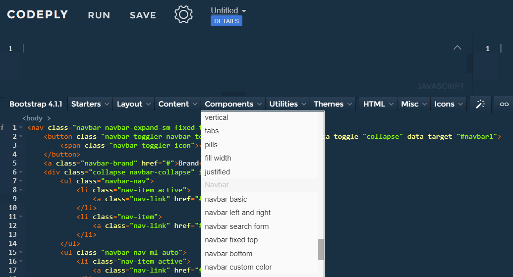
When using these more complex Bootstrap Components, you must start with examples. The best resource is the Official Bootstrap Documentation. The docs have many examples, and a “How it Works” section for each Component.
There are also tools like Codeply (that’s the one I wrote), and Bootstrap.build that include example Bootstrap code snippets that you can easily drop in an editor and play around with. For example, here’s the Navbar picked from the Codeply’s Bootstrap 4 Components list…
While most of the Bootstrap Components shown above are self-explanatory, I think the Navbar requires a full explanation. Along with the Grid, the Navbar is one of the most popular Bootstrap Components.
Only use supported content inside the Navbar. The Navbar can contain:
Don’t use Grid Rows/Columns inside the Navbar. There’s really no reason to since Utility classes can be used to align Navbar
content. For example, here the ml-auto (left auto margin) class is used to align the 2nd Nav to the right:
        <nav class="navbar navbar-expand-lg navbar-light bg-light">
          <a class="navbar-brand" href="#">Navbar</a>
          <button class="navbar-toggler"
             data-toggle="collapse"
             data-target="#nb">
             <span class="navbar-toggler-icon"></span>
         </button>
         <div id="nb" class="navbar-collapse collapse">
           <ul class="navbar-nav">
             <li class="nav-item">
              <a class="nav-link" href="#">Left aligned</a>
             </li>
           </ul>
           <ul class="navbar-nav ml-auto">
             <li class="nav-item">
              <a class="nav-link" href="#">Right aligned</a>
             </li>
          </ul>
         </div>
        </nav>
By default, the Navbar is designed for smaller screen widths on Mobile devices. Therefore the Navbar will stack vertically in a column, unless overridden with a “expand” class make the Navbar to remain horizontal above specified breakpoint widths. There are 5 breakpoints…
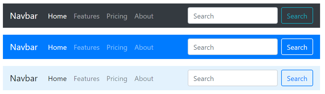
navbar-expand = always expanded (remains horizontal)navbar-expand-sm = expands on sm widths > 576pxnavbar-expand-md = expands on md widths > 768pxnavbar-expand-lg = expands on lg widths > 992pxnavbar-expand-xl = expands on xl widths > 1200pxThe Navbar uses the navbar-light and navbar-dark classes to determine the foreground colors of the brand, links and toggler (hamburger) icon. Make sure you use the appropriate classes to make the Navbar content display.
navbar-dark to for darker colored backgroundsnavbar-light to for lighter colored backgroundsTo give the Navbar a background color, use one of the contextual colors (e.g. bg-primary) otherwise the Navbar is transparent.
Of course, Bootstrap is the Swiss army knife of the Web design & development world. Bootstrap encompasses many widely used CSS properties in handy Utility classes. This eliminates the need to write the same CSS over-and-over again to apply styles to different HTML elements. You many know it as D.R.Y.
So instead of writing this…
        <style>#mydiv { text-alignment: center }</style>
        <div id="mydiv" class="text-center">Centered text</div>
You simply utilize Bootstrap’s text-center alignment class wherever it’s needed…
<div id="mydiv" class="text-center">Centered text</div>
Remember, the most up-to-date Bootstrap resource is the Official Bootstrap Documentation. The docs have many examples, and a “How it Works” section for each Component.
 How to... Bootstrap